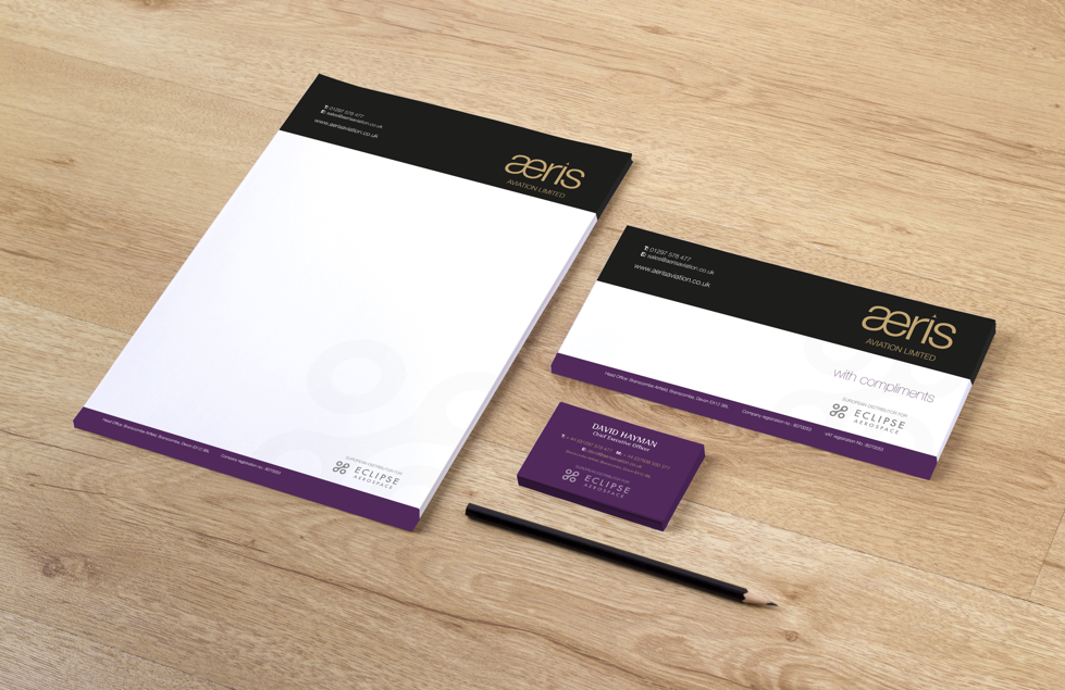
Stationary for businesses is essential, as it is the glue that ties the branding together. From the business cards to the envelopes, signage and letterhead, a consistent and high-quality range of stationery can give your brand an elite feel.
Choosing a quality letterhead is often something that can be overlooked; however, you should take as much time over this decision as any others when it comes to branding. In this article, we’ll be looking at the key decision points that you should be considering when designing your brand’s letterhead.
Choosing the Right Details
One of the main purposes of the letterhead is to provide adequate details about your business. Whether you are making contact for the first time, or the thousandth time, a letterhead should have sufficient information for the recipient to know what your business is and how to get in touch.
It’s important to choose the right details to include when designing a letterhead. Similar to a business card; email, website and phone numbers should all be included. You can also include company address and any social media profiles you may have. This means that no matter the situation, people will have the appropriate channel to contact you.
Positioning the Details
The position of the details, although not as important as the details themselves, is still something that should be considered. If in doubt, we’d suggest opting for the classic ‘top of the page’ option, as this is the most common and where people will expect to see a letterhead. Additionally, having details at the top will allow you to easily replicate the style of other stationery items such as business cards. You should be able to roughly drag and drop any design elements and details without the need to completely redesign the appearance.
Quantity of Design on the Page

One of the most common pieces of advice given within design is ‘less is more’, and this is especially true for stationery design. No matter your business, a clean, slick and clear letterhead should always be the end goal, as you’ll want to present yourself as a professional organisation. Plus, there are lots of other avenues where you can satisfy your creative appetite.
We’re by no means saying you should stick to text only, as we ourselves are big fans of a great looking design. But, the priority should always be clearly legible text, not a half-page letterhead showing off your brand’s amazing graphics.
Maintaining Consistent Branding
As mentioned above, the letterhead should always in-keep with other current stationery and branding. Using the same font, colours and style as other printed and digital materials is vital to maintaining consistent branding across the business.
You could choose to take this one step further and add elements to each piece of stationery that form a link with other pieces, similar to a jigsaw puzzle. Although this is likely to go unnoticed by recipients of your stationery, it can still prove to be a good marketing and advertising tool, showing that you have taken thought and care over every detail of your business.
Design for an Office Printer
When designing or considering various letterhead options, it’s important to bear in mind the possibility of your materials being printed within the office, as well as being printed professionally. As a printing company, we’re more than happy to work with you on your letterhead to ensure you have great looking printed materials, but we also understand that for some jobs, an office printer will just about do the trick.
Lots of detail and intricacies on a letterhead design will look great when printed professionally, but less so when done with an office printer, so bear this in mind. We can print letterheads on our digital printer for smaller businesses which will keep costs down but quality at a premium. This will allow you to go edge to edge with your letterhead design, something most home printers can’t do.
Where to Use Colour

In the design world, colour = attention, therefore, we’d suggest to use it somewhat sparingly on your letterhead. Using colour effectively means using where you want to draw people’s eye. Equally, too much use of colour can dilute the impact leaving people not sure where their attention should be focused.
Finishing Touches
Final checks are important to make sure everything looks as crisp and neat as it can. Making sure everything is justified correctly, with addresses and details in the correct place on the page. Your letterhead could also have different printing features, such as foiling or embossing, which can really give your business an elite feel. Top tip! If you use windowed envelopes, always ensure that the address section is displayed in the correct position and that none of your design elements spill over to this area and look messy.
If you are looking to design your first letterhead, or want to give your current design a new lease of life, get in touch with us. Not only are we able to design them for you, but our Exeter printing services will ensure a perfect finish for your letterhead every time you print with us.